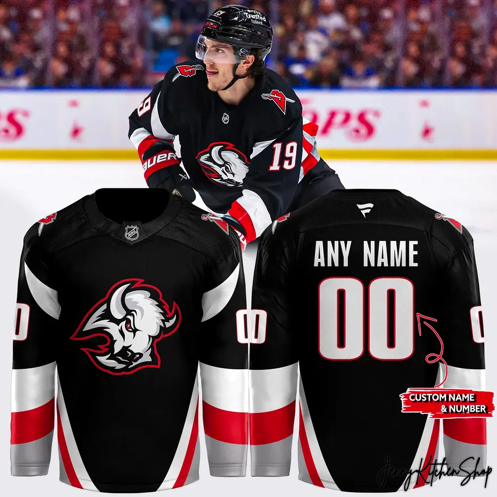
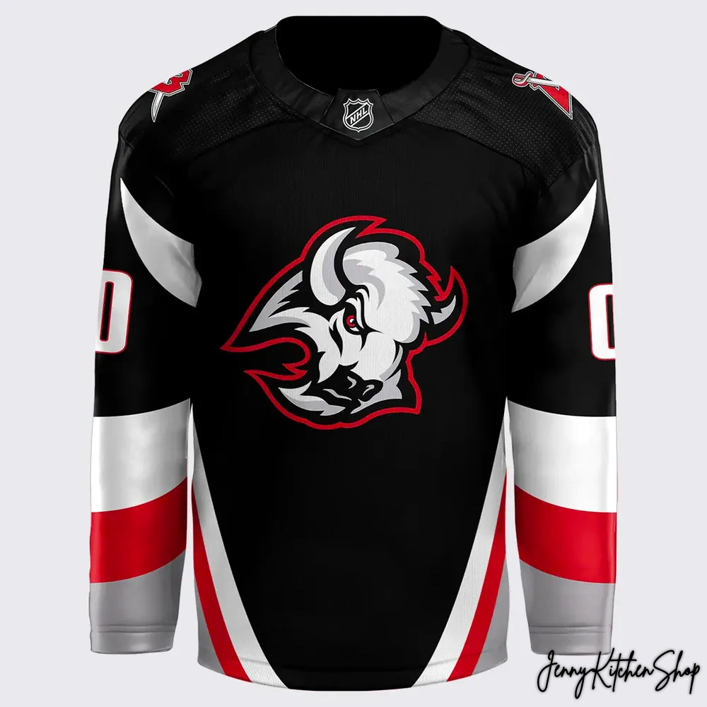
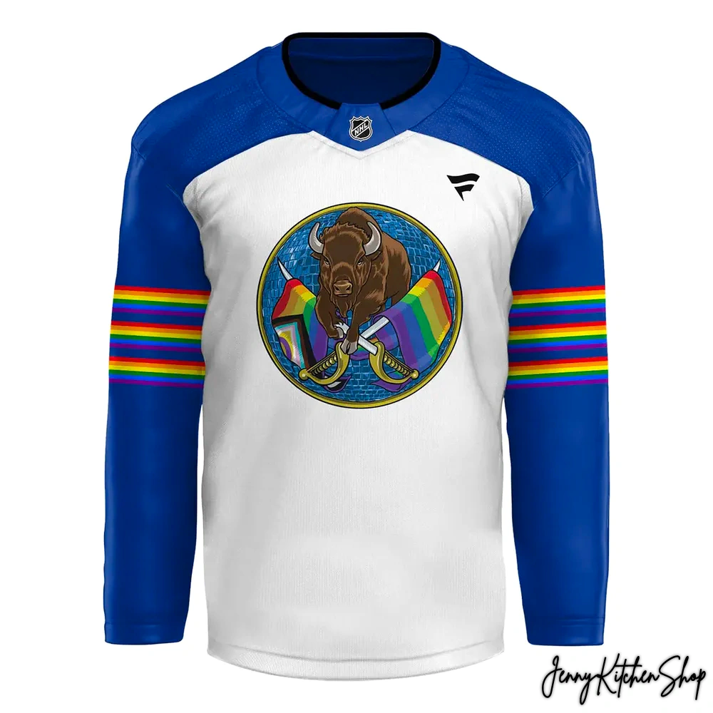
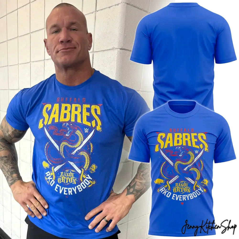
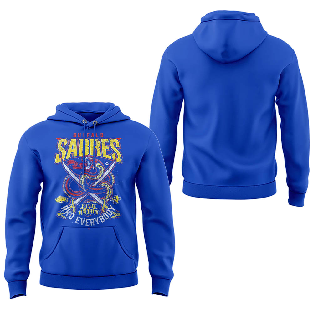
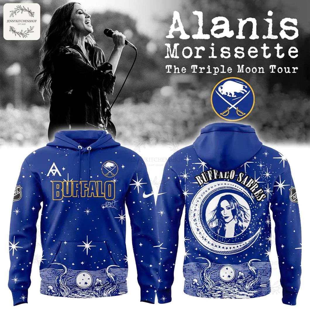
Buffalo Sabres x Randy Orton Limited 26 Orton Hockey Jersey
$44.99
Products are fulfilled and shipping from the
Apr 11
Apr 13 - Apr 15
Apr 21 - Apr 28
You can feel it, right? That electric hum of anticipation just before the puck drops, the roar of Sabres Nation echoing off the ice, a sea of blue and gold. Now, imagine that same raw energy, but infused with the chilling suspense of an “RKO Outta Nowhere!” The crowd goes wild, a different kind of intensity, a different kind of legend taking center stage. For years, we’ve stood united, whether it’s cheering on our Buffalo heroes or watching the Apex Predator stalk his prey. We’ve often wondered, what if these worlds collided? What if the ferocity of the ice met the viper’s cunning?
This isn’t just merchandise; it’s a monumental moment forged in the fires of two incredible fandoms. As a seasoned fan marketer, I’ve seen countless collaborations, but few capture the essence of their merged identities with such precision and passion. Our design team dared to dream, to bring together the unstoppable force of the Buffalo faithful and the undeniable presence of one of sports entertainment’s most dominant figures. This isn’t a lazy logo swap; it’s a deep dive into the spirit of both, creating something truly unique that competitors often miss—a story told in every stitch and graphic. It’s an authentic human connection, crafted by fans, for fans, ensuring this isn’t just an item you buy, but a piece of history you wear.
RKO Outta Nowhere Meets Sabres Nation: The Ultimate Crossover Hockey Jersey
This limited-edition jersey isn’t just a garment; it’s a visual manifesto, a bold declaration of allegiance to both the ice and the squared circle. Every element has been meticulously crafted to speak volumes to the true fan, blending iconic aesthetics with a fresh, aggressive spirit.
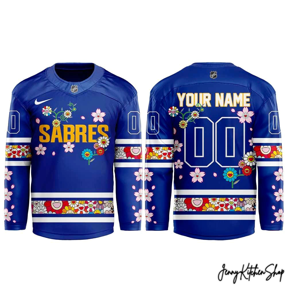
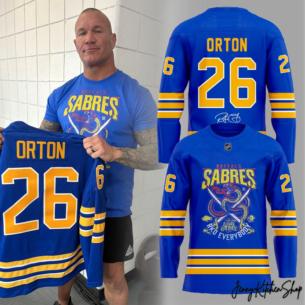
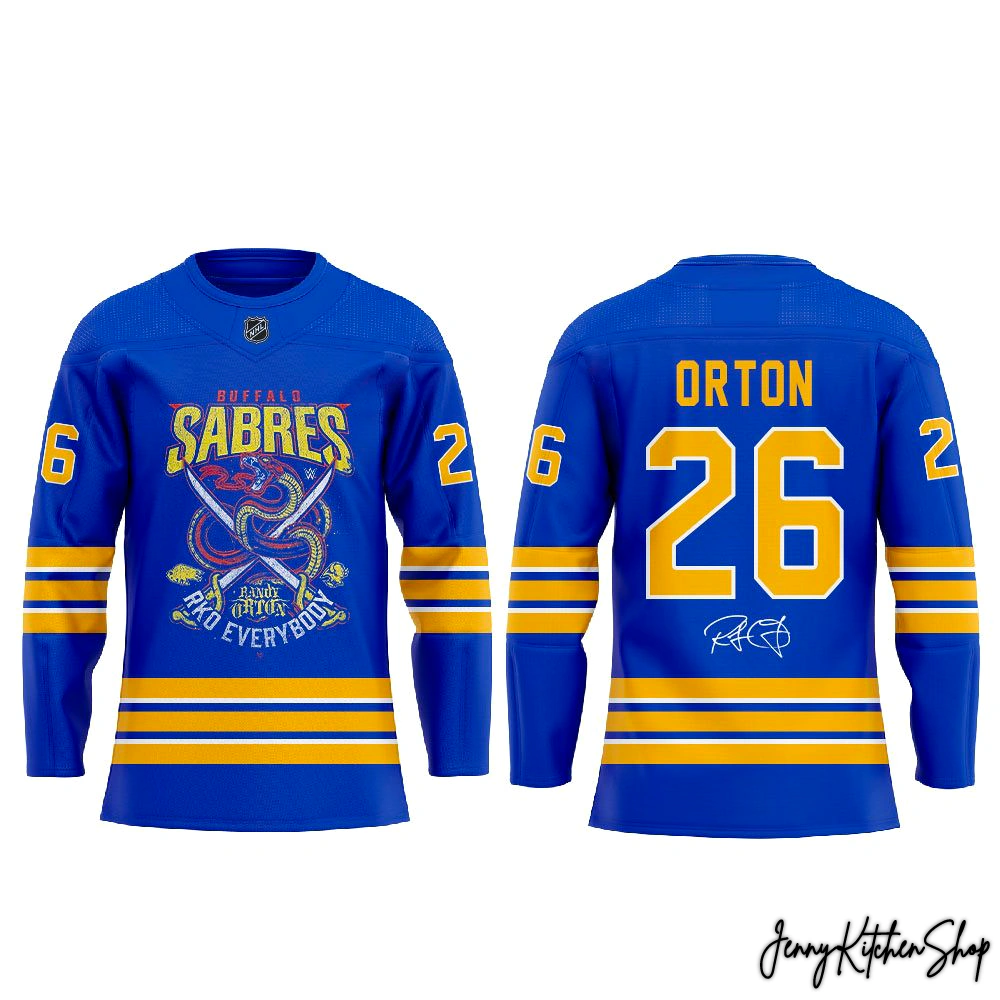
From the moment your eyes land on the front, you’re struck by the dynamic interplay of two powerful worlds. The foundation is a rich, vibrant royal blue – the undeniable heart of Buffalo’s spirit on the ice. Across the chest, “BUFFALO” stands proud in a classic, strong typeface, immediately grounding the design in its hockey heritage. Below it, “SABRES” sweeps with a graceful yet powerful gold script, outlined in crisp white, a familiar beacon for any faithful fan.
But then, the unexpected twist, the “outta nowhere” strike that makes this jersey truly unique. Coiled and ready for action, a fierce, serpentine dragon, a clear nod to the legendary Viper, dominates the central crest. Its intricate scales and intense gaze are rendered with stunning detail, immediately conveying the raw power and calculated aggression of Randy Orton. Intertwined with this mythical beast are two iconic crossed sabers, their hilts accented with a fiery red, symbolizing both the team’s historic weaponry and the readiness for battle. The designer’s vision here was to create a crest that felt organic, as if the Sabres’ own mascot had been infused with the Viper’s venom, a true testament to creative storytelling beyond typical fan apparel. This isn’t just a logo; it’s a narrative.
Below this breathtaking central artwork, Randy Orton’s unmistakable mantra is emblazoned: “RKO” in bold, commanding block letters, followed by his distinctive, almost signed-off “RANDY ORTON” in a smaller, confident script, and finally, “EVERYBODY” in a matching block font. This isn’t just text; it’s a rally cry, a statement of dominance that resonates deeply with his loyal following. This layering of text and imagery, marrying the traditional team identity with a powerful personal brand, is a design feat that sets this piece far above generic collaborations.
Turning to the back, the storytelling continues with impactful clarity. “ORTON” is boldly stitched across the shoulders in a brilliant gold, outlined in white, ensuring immediate recognition. Below it, the striking number “26” demands attention, rendered in the same vibrant gold with a sharp white outline. While “26” might not be a traditional jersey number for either entity, its singular presence here marks this collaboration as truly unique, a number specifically chosen for this crossover event, making it distinctly Orton’s for this monumental mashup. And, for the ultimate fan connection, an authentic replication of Randy Orton’s personal signature is subtly placed beneath the number, a personal touch that elevates this from mere merch to a genuine piece of memorabilia.
The sleeves carry the blue and gold theme with elegance and purpose. Horizontal stripes of vibrant gold and clean white encircle the lower sleeves, a classic hockey jersey element that connects it firmly to the sport’s heritage. Intriguingly, on each shoulder, segments of the “26” are displayed – a bold “6” on one side and a proud “2” on the other – a subtle yet clever design choice that makes the jersey feel cohesive and thoughtfully designed, demonstrating a level of detail often overlooked by competitors. Even the official league shield, a mark of genuine authenticity, is subtly integrated into the collar, assuring fans this isn’t just a tribute, but an officially sanctioned crossover. Our designer’s inspiration was to ensure every angle told a part of the story, from the grandeur of the main crest to the subtle details on the shoulders, making it a truly immersive visual experience.
More Than Merch — A Cultural Connection
This isn’t just fabric and thread; it’s a bridge between worlds, a tangible piece of a cultural moment. For the fan who lives for the roar of the crowd at the arena and the electrifying anticipation of an RKO, this jersey is more than clothing – it’s a badge of honor, a symbol of your diverse and passionate fandom. You’re not just wearing a team’s colors or a wrestler’s logo; you’re embodying the spirit of an unprecedented fusion.
Imagine stepping into KeyBank Center for a Sabres game, the blue and gold flowing around you, and then someone spots the coiled viper and the “RKO EVERYBODY” script. Or showing up at a live wrestling event, and the chants of “Orton!” are amplified by the Sabres’ iconic colors. This jersey sparks conversation, connects communities, and instantly identifies you as a true connoisseur of epic moments. It’s a collectible piece of history, celebrating a unique collaboration that speaks to the hearts of both hockey and wrestling enthusiasts. Unlike generic fan gear, this piece represents a deep dive into the emotional landscape of fan identity, serving as a powerful emblem of shared passion and unique belonging, filling a void that many competitor descriptions fail to address. It’s built for the true fan who understands that some stories are best told with a fierce dragon, crossed sabers, and an “Outta Nowhere” legend.
Frequently Asked Questions
Product Material Jersey Information:
- Premium Fabric: Crafted from high-quality 200GSM pique fabric, offering a textured, breathable, and lightweight feel that keeps you cool and comfortable during intense games or casual wear.
- Decoration Technique: All-over print sublimation — your design is printed directly onto the fabric before being cut and sewn, creating a vibrant, long-lasting finish that won’t fade or crack.
- Material Composition: Durable pique polyester blend with excellent moisture-wicking performance.
Care Instructions:
- Machine wash cold, inside-out, with similar colors.
- Use mild detergent; do not bleach.
- Tumble dry low or hang to air dry.
- Do not iron directly on printed areas.
- Avoid dry cleaning to preserve the sublimated print quality
Why You’ll Love It:
This jersey blends performance, comfort, and personalized style — perfect for expressing your fandom while enjoying the freedom and durability of a premium sportswear piece.
Shipping Info
All products at Jenny Kitchen Shop are made-to-order, ensuring each item is crafted with care and tailored specifically for you.
1. Processing Time
-
Processing time: 2–5 business days
-
Orders are processed Monday through Friday (excluding holidays).
-
This stage includes order verification, design preparation, custom adjustments (if applicable), printing, quality inspection, and packaging.
Please note: Processing time is separate from shipping time.
2. Production Time (Print-On-Demand & Custom Design)
Our products are not mass-produced. Each item is created only after an order is placed, which allows us to offer customized details and exclusive designs.
Production may take longer because:
-
Some products are custom-made or personalized specifically for individual customers.
-
Certain designs are exclusive, created uniquely per order rather than pre-printed.
-
Each item goes through manual quality checks to ensure accuracy, print clarity, and durability.
-
Production time can vary based on product type, order volume, and seasonal demand.
-
During peak seasons or special promotions, production may take slightly longer than usual.
This process allows us to deliver higher-quality, one-of-a-kind products rather than generic, mass-produced items.
3. Shipping Time & Delivery Estimates
To ensure faster and more efficient delivery, we work with multiple production partners and fulfillment facilities across the United States, Europe, Australia, and Asia.
Your order will be:
-
Produced at the most suitable facility based on your location and product type.
-
Shipped from the nearest available production hub whenever possible.
Estimated shipping times after production:
| Region | Estimated Delivery Time |
|---|---|
| United States | 5–10 business days |
| Canada | 7–15 business days |
| Europe | 7–15 business days |
| Australia / New Zealand | 10–15 business days |
| Rest of the World | 10–20 business days |
Delivery times may vary depending on destination, customs processing, and local carrier performance.
Return & Warranty
1. Print-On-Demand & Custom Items
All products are made-to-order and custom-produced specifically for each customer.
-
All sales are final
-
We do not accept returns or exchanges for incorrect size selection, change of mind, or buyer’s remorse
Please review product details, sizing charts, and order information carefully before placing your order.
2. Eligible Refunds & Replacements
We will gladly offer a replacement or refund if:
-
You receive a defective or damaged item
-
You receive the wrong item or incorrect design
To be eligible, please:
-
Contact us within 7 days of delivery
-
Provide clear photos showing the issue
-
Include your order number in the request
Once approved, we will arrange a replacement or refund at no additional cost.
3. Important Notes
-
Slight variations in color or placement may occur due to the custom printing process
-
Refunds or replacements are not issued for minor differences that do not affect product quality or usability

