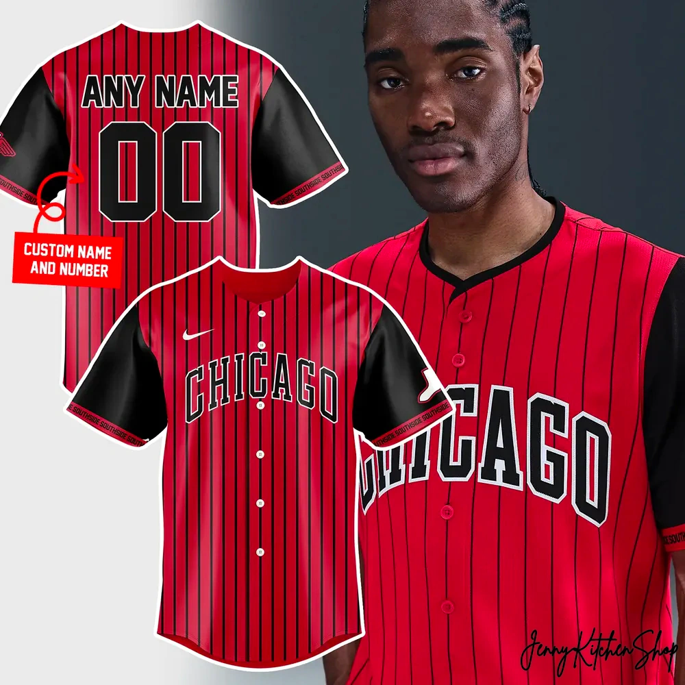
Chicago White Sox City Connect 2026 New Jersey
$41.99
Products are fulfilled and shipping from the
Jan 11
Jan 12 - Jan 14
Jan 20 - Jan 27
The roar of the crowd, the smell of freshly cut grass under the stadium lights, the rhythm of the city echoing in your chest. If you’re a true Chicago baseball faithful, you don’t just watch the game; you live it. You feel the Southside spirit coursing through your veins, a defiant pride that sets you apart. This isn’t just about strikes and homers; it’s about heritage, hustle, and the unbreakable bond of a community that bleeds black and white—and now, a bold new shade that tells an even deeper story.
We’ve seen the merchandise that just slaps a logo on a shirt, the generic offerings that miss the pulse of what it means to be a real fan. We’ve spent countless hours dissecting what makes fan gear truly connect, and we noticed a gap: the soul, the narrative, the very essence of the fandom often gets lost. Our mission? To create something that wasn’t just worn, but felt. This isn’t just a jersey; it’s a wearable testament to your unwavering loyalty, a beacon of the Southside’s enduring legacy, perfectly crafted for the future.
Chicago Southside Spirit Unleashed: Your City Connect 2026 Statement Piece
Forget everything you thought you knew about traditional team colors. The moment you lay eyes on the Chicago White Sox City Connect 2026 New Jersey, you understand this is a revolution in fan apparel, a daring reinterpretation born from the heart of the Windy City. Our design team poured over urban landscapes, historical markers, and, most importantly, the vibrant energy of the Southside itself to craft this visual masterpiece.
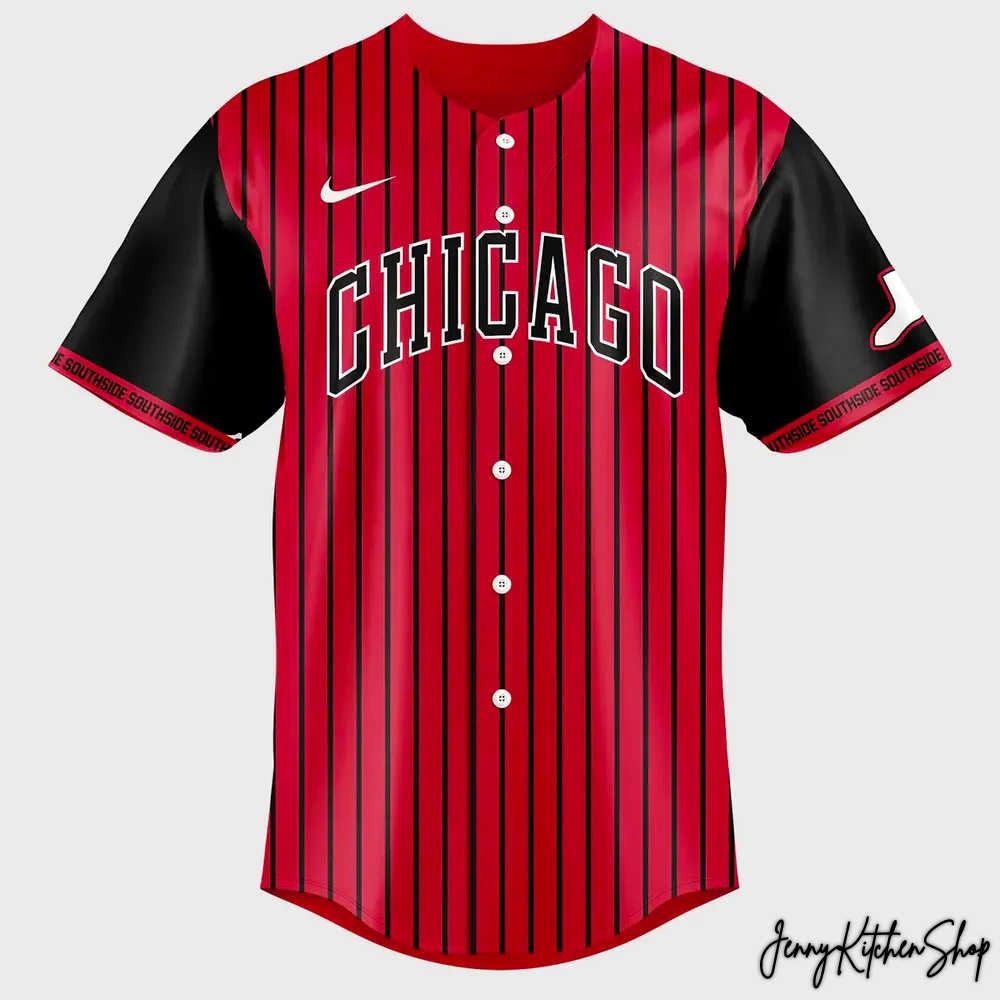
At its core, the jersey commands attention with its striking deep red hue, a bold departure that signifies the fiery passion and resilience embedded in every Chicago fan. This isn’t just any red; it’s a power statement, symbolizing the intensity of game day and the unstoppable drive of our beloved team. Vertical thin black pinstripes elegantly stretch from collar to hem, a timeless nod to baseball’s rich tradition, yet reimagined to create a sharp, modern silhouette. These aren’t just lines; they are the threads connecting past glories with future triumphs.
Dominating the chest is the iconic “CHICAGO” text, rendered in a powerful, arched typeface, standing out in crisp white with a bold black outline. This isn’t just a city name; it’s an anthem, a declaration of identity that resonates with every brick and beam of this incredible city. The creative vision behind this font choice was to evoke the architectural grandeur and unyielding spirit of Chicago, ensuring it feels both classic and cutting-edge.
The sleeves are a rich, solid black, providing a sophisticated contrast to the vibrant red body. This design choice anchors the jersey, bringing balance and emphasizing the powerful color story. On the left chest, a subtle, yet unmistakable athletic emblem in white signifies quality and performance, a mark recognized globally for excellence without needing a specific brand name.
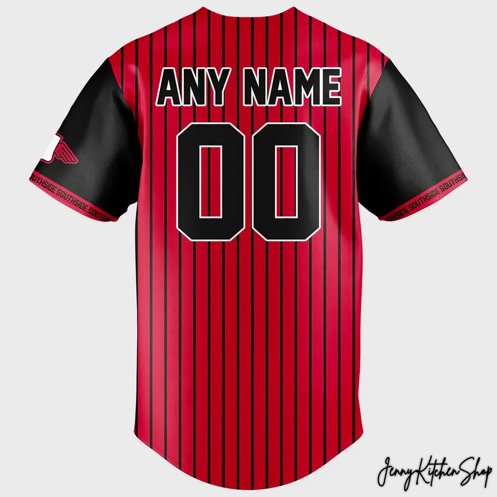
But the story deepens as we examine the sleeves. The right sleeve proudly features a white outline of the state of Illinois, a subtle yet potent symbol of regional pride. Within this outline, a distinct team-related graphic subtly reinforces our bond to the state and its baseball heritage. The left sleeve takes us directly to the heart of the community: the sleeve cuffs are adorned with “SOUTHSIDE” repeated in bold white text against a black band. This detail is more than just lettering; it’s a rallying cry, a tribute to the neighborhood that breathes life into the team. Our designers wanted to ensure that every angle, every stitch, told a piece of the Chicago story, focusing on the unique elements that make this jersey a standout, distinguishing it from any generic fan apparel that often overlooks these crucial cultural touchstones. This isn’t just a uniform; it’s a canvas depicting the soul of our city and its legendary baseball roots.
More Than Merch — A Cultural Connection
This isn’t merely an item of clothing; it’s a badge of honor, a collectible piece of the future, and a profound cultural connection for any White Sox fan. When you pull on this City Connect 2026 Jersey, you’re not just wearing team colors; you’re embracing a narrative, a vision, and a community.
The emotional value transcends the fabric and design. This jersey is a declaration of allegiance, a silent nod to fellow Southsiders, and a conversation starter that instantly links you to a shared passion. Imagine walking into Guaranteed Rate Field on game day, the sea of black and white punctuated by the striking red and black pinstripes of this future classic. You’re not just blending in; you’re making a statement. You’re part of the evolution, a custodian of the team’s ongoing legacy.
This design holds immense cultural significance. It represents a bold step forward for fan apparel, marrying tradition with a vibrant, forward-looking aesthetic. It’s built for the game day atmosphere, yes, but it’s equally at home in your casual rotation, at a neighborhood BBQ, or simply as a proud display of your Chicago roots. Competitors often miss the mark by failing to imbue their merchandise with this level of storytelling and cultural weight. They offer clothing; we offer identity. This jersey isn’t just for rooting; it’s for living, breathing, and celebrating what it truly means to be a Chicago baseball fan. It’s owning a piece of history, anticipating the future, and solidifying your place within the greatest fandom in sports.
Frequently Asked Questions

 ,
,
Shipping Info
Shipping Information
All products at Jenny Kitchen Shop are made-to-order, ensuring each item is crafted with care and tailored specifically for you.
1. Processing Time
-
Processing time: 2–5 business days
-
Orders are processed Monday through Friday (excluding holidays).
-
This stage includes order verification, design preparation, custom adjustments (if applicable), printing, quality inspection, and packaging.
Please note: Processing time is separate from shipping time.
2. Production Time (Print-On-Demand & Custom Design)
Our products are not mass-produced. Each item is created only after an order is placed, which allows us to offer customized details and exclusive designs.
Production may take longer because:
-
Some products are custom-made or personalized specifically for individual customers.
-
Certain designs are exclusive, created uniquely per order rather than pre-printed.
-
Each item goes through manual quality checks to ensure accuracy, print clarity, and durability.
-
Production time can vary based on product type, order volume, and seasonal demand.
-
During peak seasons or special promotions, production may take slightly longer than usual.
This process allows us to deliver higher-quality, one-of-a-kind products rather than generic, mass-produced items.
3. Shipping Time & Delivery Estimates
To ensure faster and more efficient delivery, we work with multiple production partners and fulfillment facilities across the United States, Europe, Australia, and Asia.
Your order will be:
-
Produced at the most suitable facility based on your location and product type.
-
Shipped from the nearest available production hub whenever possible.
Estimated shipping times after production:
| Region | Estimated Delivery Time |
|---|---|
| United States | 5–10 business days |
| Canada | 7–15 business days |
| Europe | 7–15 business days |
| Australia / New Zealand | 10–15 business days |
| Rest of the World | 10–20 business days |
Delivery times may vary depending on destination, customs processing, and local carrier performance.

