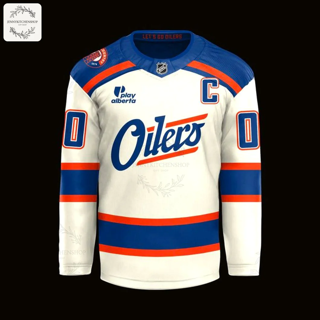
Edmonton Oilers 2026 Our Turtle Island Hockey Jersey
$44.99
Products are fulfilled and shipping from the
Feb 19
Feb 20 - Feb 24
Mar 02 - Mar 09
It’s more than just the roar of the crowd or the flash of the goal light. It’s a feeling that runs deep in the soul of Oil Country. It’s the chill you get walking towards the arena on a cold winter night, the collective breath held during a nail-biting power play, the shared history that echoes through the stands. For years, we’ve worn the iconic orange and blue as our armour. But now, we have the chance to wear something more. We have the chance to wear a story—a story of the land itself. This isn’t just another jersey. This is a connection, a bridge between the team we love and the ancient, enduring spirit of the place we call home.
This jersey was born from a vision of unity and respect. The designer, inspired by the deep Indigenous roots of the land where our team battles, wanted to create a piece that spoke a truth older than the game itself. They imagined a design that could honour the history of Turtle Island while celebrating the modern-day gladiators of the ice. The result is a powerful symbol of community, a testament to the idea that we are all part of a larger story, woven together by shared passion and a shared home.
Wear the Story: The Edmonton Oilers 2026 Turtle Island Jersey
Forget everything you think you know about a typical hockey sweater. This jersey is a masterclass in storytelling, a wearable piece of art that carries profound meaning in every stitch and every shade of colour. It was designed to be a conversation starter, a symbol of a deeper connection to the game and the community.
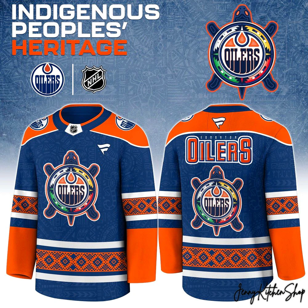
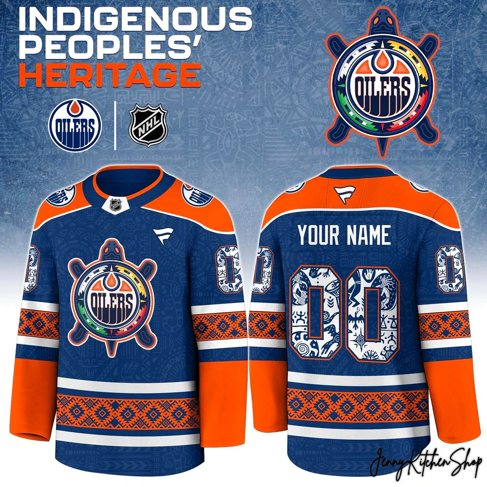
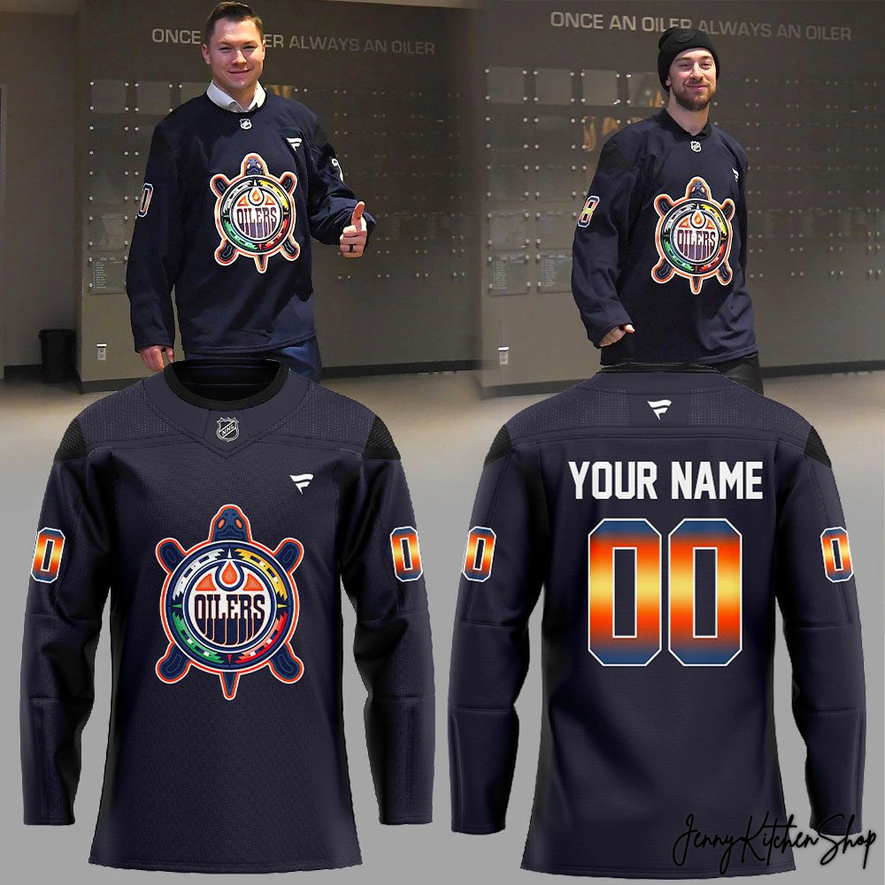
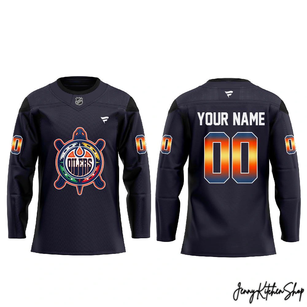
The first thing that captures your eye is the magnificent crest. In place of the standard logo, you’ll find a powerful and beautifully detailed turtle. In many Indigenous cultures, the turtle represents Turtle Island—the name for the continent of North America. It symbolizes truth, wisdom, and the very land on which the game is played. This isn’t just an animal; it’s the foundation of our home.
Look closer at the turtle’s shell. It’s not a simple pattern.
- A Deeper Logo: Nestled in the heart of the turtle, protected and central to its being, is our beloved Oilers oil drop logo. This isn’t an afterthought; it’s a deliberate statement. The team, the passion, the community—it all exists within, and is supported by, the spirit of this land.
- Colours of Meaning: The segments of the shell are alive with the sacred colours of the medicine wheel—red, yellow, black, and white—representing the four directions and the holistic nature of life. These vibrant hues encircle the Oilers logo, symbolizing a community of all peoples coming together under one banner.
- A Sunset on Ice: The custom name and numbers on the back and sleeves are where modern hockey aesthetics and ancient beauty collide. The stunning gradient flows from a brilliant, fiery orange to a deep, royal blue. It’s the colour of a prairie sunset over the North Saskatchewan River, a visual tribute to the natural beauty of Oil Country that you won’t find on any other jersey.
- The Canvas: The entire design is set against a deep, dark navy blue base. It’s the colour of a vast night sky or the deep, calm waters of a northern lake. It makes the vibrant colours of the crest and the fiery gradient of the numbers explode with life, ensuring this jersey stands out in any arena.
This is a design that asks you to look closer, to understand its layers. While other special edition jerseys might simply change a colour scheme, this one rewrites the entire visual language. It’s a bold, respectful, and breathtakingly beautiful piece that elevates fan apparel into a form of cultural celebration.
More Than Merch — A Cultural Connection
Owning this jersey is about more than just supporting the team. It’s about embracing a bigger picture. It’s a statement that you understand the connection between the roar of 18,000 fans and the quiet, enduring spirit of the land beneath the ice. This is a collector’s piece, a snapshot of a moment when sport and culture came together to create something truly special for 2026.
Imagine walking into the arena, not just as a fan, but as a custodian of this story. This jersey is your way of showing you’re part of a community that values respect, honours history, and celebrates unity. It’s for the fan who feels the history in the air, who understands that the passion for the Oilers is woven into the very fabric of Edmonton—Amiskwaciwâskahikan.
When you pull this jersey on, you’re not just wearing team colours. You’re wearing a statement of respect. You’re wearing a tribute to the artists and storytellers who came before. You’re telling the world that you are part of a fan base that is proud, passionate, and deeply connected to its roots. This is how you show you’re a true member of Oil Country.
Frequently Asked Questions
Product Material Jersey Information:
- Premium Fabric: Crafted from high-quality 200GSM pique fabric, offering a textured, breathable, and lightweight feel that keeps you cool and comfortable during intense games or casual wear.
- Decoration Technique: All-over print sublimation — your design is printed directly onto the fabric before being cut and sewn, creating a vibrant, long-lasting finish that won’t fade or crack.
- Material Composition: Durable pique polyester blend with excellent moisture-wicking performance.
Care Instructions:
- Machine wash cold, inside-out, with similar colors.
- Use mild detergent; do not bleach.
- Tumble dry low or hang to air dry.
- Do not iron directly on printed areas.
- Avoid dry cleaning to preserve the sublimated print quality
Why You’ll Love It:
This jersey blends performance, comfort, and personalized style — perfect for expressing your fandom while enjoying the freedom and durability of a premium sportswear piece.
Shipping Info
All products at Jenny Kitchen Shop are made-to-order, ensuring each item is crafted with care and tailored specifically for you.
1. Processing Time
-
Processing time: 2–5 business days
-
Orders are processed Monday through Friday (excluding holidays).
-
This stage includes order verification, design preparation, custom adjustments (if applicable), printing, quality inspection, and packaging.
Please note: Processing time is separate from shipping time.
2. Production Time (Print-On-Demand & Custom Design)
Our products are not mass-produced. Each item is created only after an order is placed, which allows us to offer customized details and exclusive designs.
Production may take longer because:
-
Some products are custom-made or personalized specifically for individual customers.
-
Certain designs are exclusive, created uniquely per order rather than pre-printed.
-
Each item goes through manual quality checks to ensure accuracy, print clarity, and durability.
-
Production time can vary based on product type, order volume, and seasonal demand.
-
During peak seasons or special promotions, production may take slightly longer than usual.
This process allows us to deliver higher-quality, one-of-a-kind products rather than generic, mass-produced items.
3. Shipping Time & Delivery Estimates
To ensure faster and more efficient delivery, we work with multiple production partners and fulfillment facilities across the United States, Europe, Australia, and Asia.
Your order will be:
-
Produced at the most suitable facility based on your location and product type.
-
Shipped from the nearest available production hub whenever possible.
Estimated shipping times after production:
| Region | Estimated Delivery Time |
|---|---|
| United States | 5–10 business days |
| Canada | 7–15 business days |
| Europe | 7–15 business days |
| Australia / New Zealand | 10–15 business days |
| Rest of the World | 10–20 business days |
Delivery times may vary depending on destination, customs processing, and local carrier performance.
Return & Warranty
1. Print-On-Demand & Custom Items
All products are made-to-order and custom-produced specifically for each customer.
-
All sales are final
-
We do not accept returns or exchanges for incorrect size selection, change of mind, or buyer’s remorse
Please review product details, sizing charts, and order information carefully before placing your order.
2. Eligible Refunds & Replacements
We will gladly offer a replacement or refund if:
-
You receive a defective or damaged item
-
You receive the wrong item or incorrect design
To be eligible, please:
-
Contact us within 7 days of delivery
-
Provide clear photos showing the issue
-
Include your order number in the request
Once approved, we will arrange a replacement or refund at no additional cost.
3. Important Notes
-
Slight variations in color or placement may occur due to the custom printing process
-
Refunds or replacements are not issued for minor differences that do not affect product quality or usability


