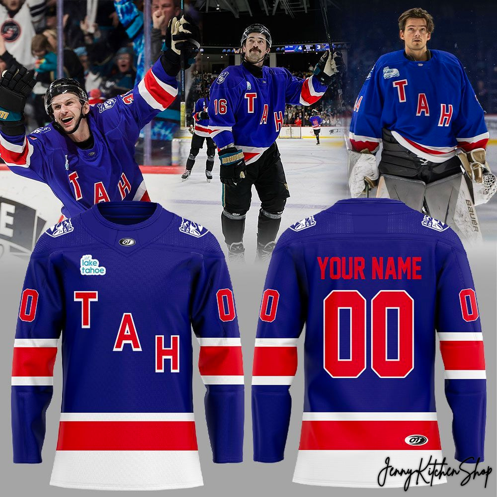
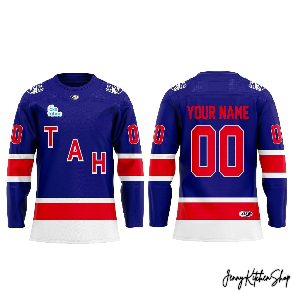
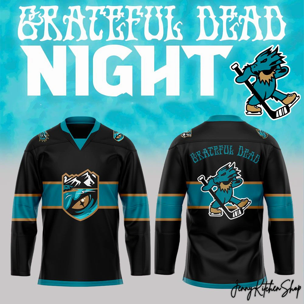
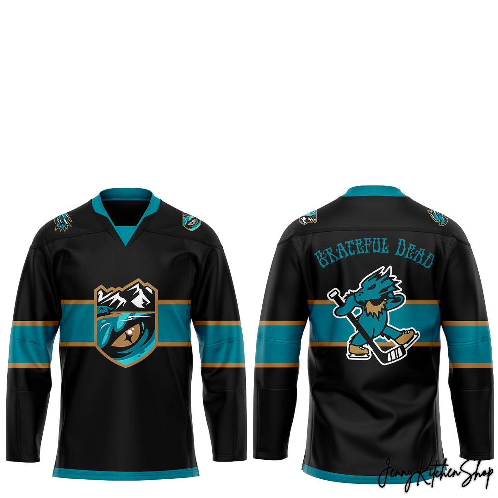
Tahoe Knight Monsters Military Appreciation 2026 Hockey Jersey
$44.99
Products are fulfilled and shipping from the
Apr 04
Apr 06 - Apr 08
Apr 14 - Apr 21
That crisp chill in the air, the collective roar of the crowd when the puck drops, the electric pulse of shared passion – that’s the magic of game night. But some nights transcend the score, becoming something deeper, more profound. They’re a salute, a resonant echo of gratitude for those who stand guard for us all. For the Tahoe Knight Monsters faithful, the 2026 Military Appreciation game isn’t just a date on the calendar; it’s a moment to unite the fierce spirit of our team with the unwavering courage of our service members.
This isn’t just another jersey. It’s a banner woven from the very essence of Lake Tahoe’s rugged beauty and the indomitable will of our military. As fans, we often crave that tangible link to the game, that piece of the energy we can carry with us. Our designer, deeply rooted in the fan community and understanding the reverence for those who serve, envisioned this jersey not as mere apparel, but as a wearable testament to honor, unity, and the shared strength that defines both our team and our nation’s heroes. While other designs might simply drape a theme over a standard template, we saw an opportunity to craft a story, a connection that goes beyond the rink, directly to the heart of what it means to be a true fan and a grateful citizen.
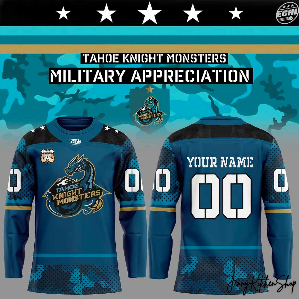
Unleash the Spirit: The Tahoe Knight Monsters 2026 Military Appreciation Battle Jersey
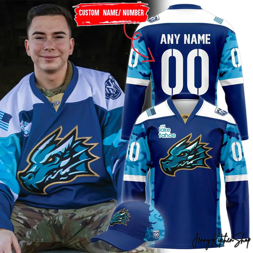
From the moment your eyes land on this masterpiece, the intention is clear: this jersey commands attention, respect, and admiration. Every line, every color, every intricate detail tells a story, a narrative crafted with purpose and passion by a designer who lives and breathes this culture. This isn’t just a jersey; it’s a piece of art that blends the ferocious identity of the Knight Monsters with a profound tribute to military service.
Let’s break down the visual symphony that makes this jersey truly extraordinary:
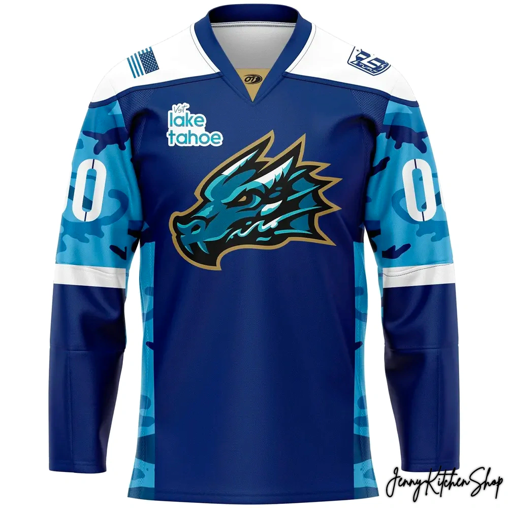
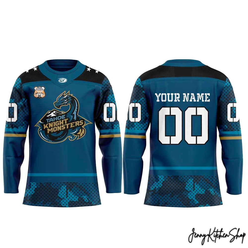
- The Dominant Teal Canvas: The primary deep teal color isn’t just a shade; it’s the profound blue of Lake Tahoe itself, reflecting the mysterious depths and majestic tranquility of our home. It grounds the jersey, providing a rich, vibrant backdrop that symbolizes the natural power of our region and the resolute spirit of our team. Our designer chose this as the foundational hue to represent stability and the vast, unyielding spirit of our community.
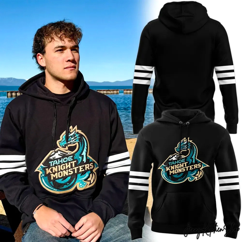
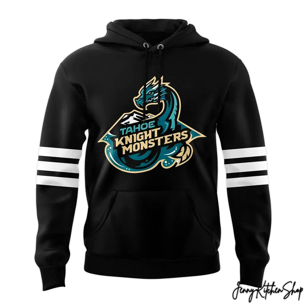
- The Fierce Knight Monster Emblem (Front and Center): Dominating the chest is the iconic Tahoe Knight Monsters logo – a powerful, stylized dragon head rendered in striking gold, white, and black. This isn’t just a creature; it’s a guardian, a symbol of the team’s ferocity, resilience, and readiness to conquer any challenge. The golden hues signify valor and victory, while the deep black adds a layer of formidable strength. The designer’s vision here was to make the dragon a visual metaphor for the courage inherent in both battle and sport. Unlike many jerseys that feature static logos, this one feels alive, poised for action.
- Integrated Digital Camouflage Pattern: Look closely at the lower sleeves, side panels, and the entire lower back – a distinctive, subtly integrated digital camouflage pattern emerges. This isn’t a jarring addition but a sophisticated blend of blue, black, grey, and hints of brown. It’s a respectful, yet powerful, nod to military aesthetics, representing protection, strategy, and the readiness of our service members. The designer’s creative process here involved carefully selecting a camo that complements the primary teal, avoiding anything overly harsh, to ensure it communicates respect and strength without overshadowing the team’s identity. This seamless integration sets it apart from more generic “military” designs that simply overlay a pattern.
- Brave Golden and Black Sleeve Stripes: Adorning the sleeves are bold horizontal stripes in gold and black. These aren’t just decorative; they harken back to classic hockey jersey aesthetics while providing a vibrant contrast. The gold reinforces themes of honor and achievement, while the black adds depth and intensity. The designer carefully positioned these stripes to balance the military appreciation elements with traditional hockey heritage, making it feel authentic to the sport.
- The Embellished Shoulder Patch: On the left shoulder, a circular patch stands out. It features a unique mascot, possibly an event-specific character or a playful take on a Lake Tahoe legend, holding a hockey stick. This detail adds a layer of narrative, perhaps commemorating a specific event or local lore, making the jersey even more unique and collectible, a subtle insider nod for true fans.
- Stars of Valor (Upper Back/Collar): Across the upper back, just below the collar, five crisp white stars are emblazoned against a black background. These stars are more than just decoration; they are a direct representation of military valor, heroism, and the sacrifices made for freedom. They elevate the jersey’s meaning, transforming it from mere fan gear into a symbol of profound appreciation. Our designer poured significant thought into placing these stars prominently, ensuring they serve as a constant reminder of the jersey’s core tribute.
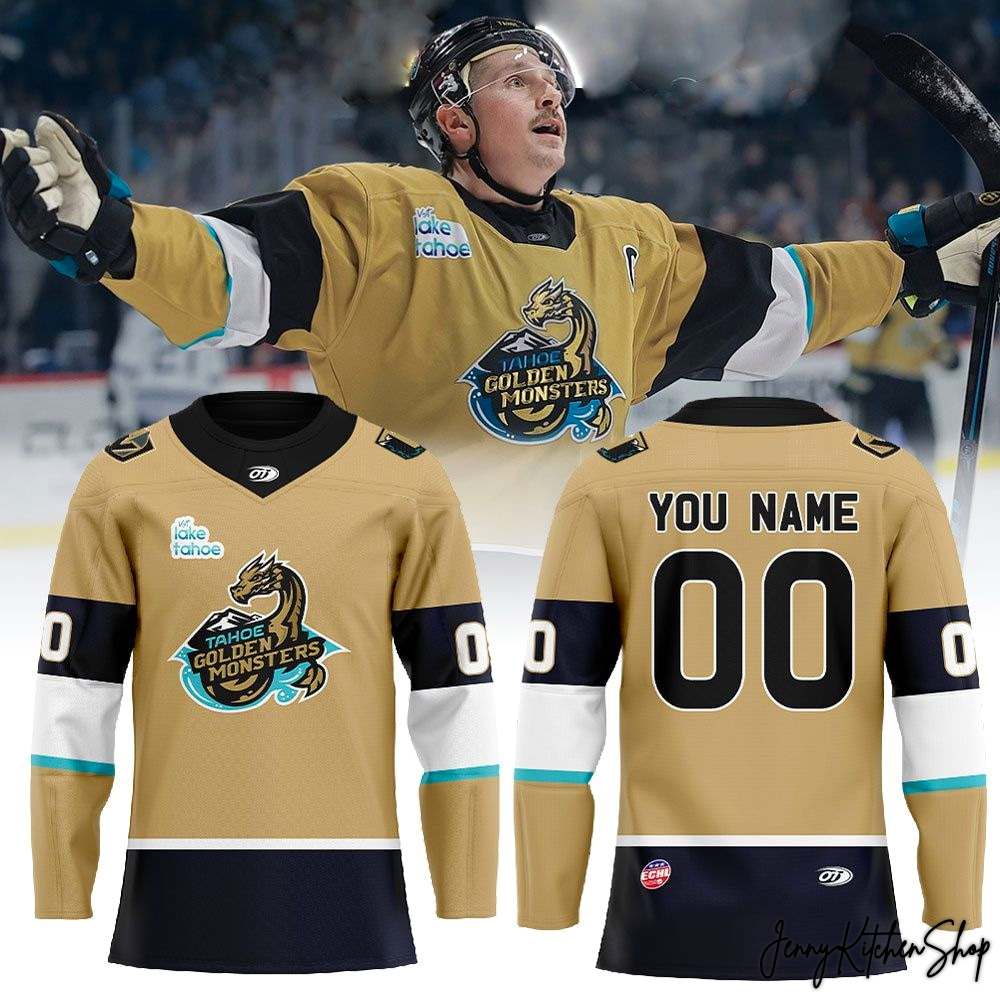
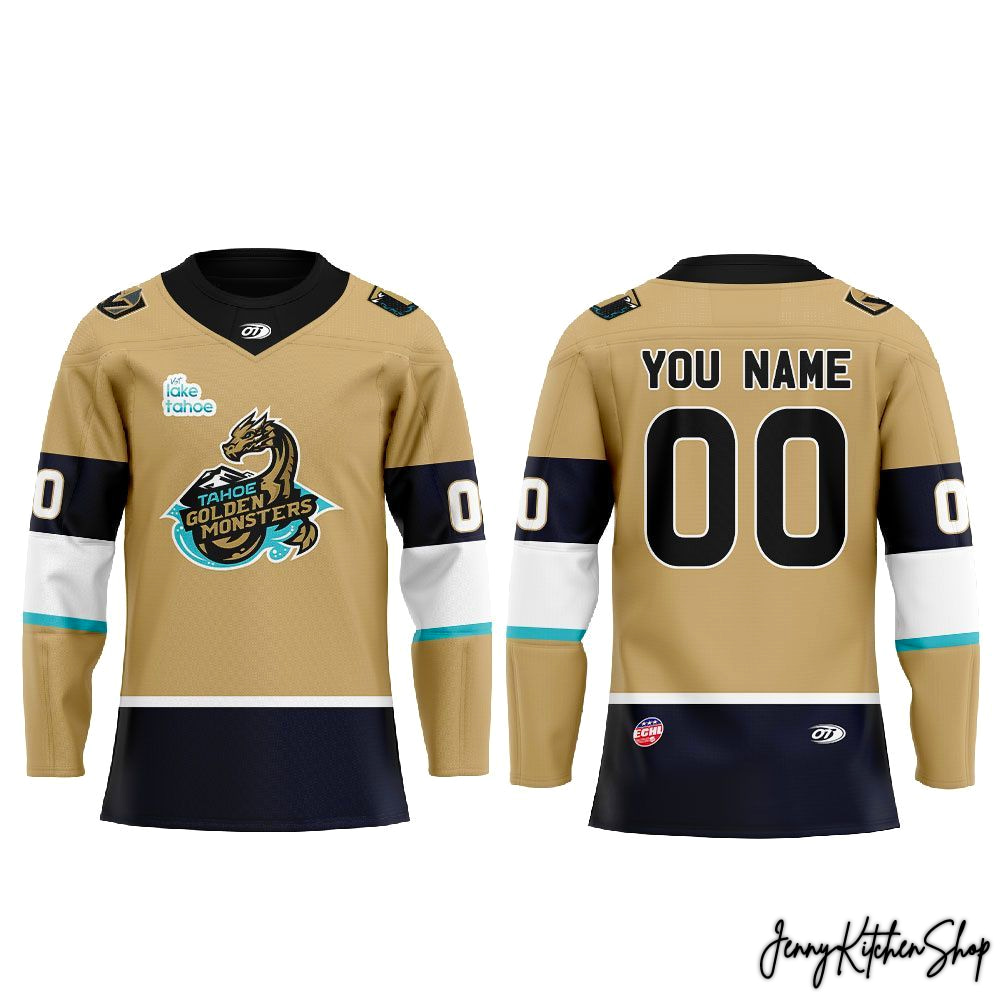
- Personalized Legacy (Back): The back of the jersey offers the ultimate personal touch: “YOUR NAME” above the large, crisp white “00” numbers. This customization option isn’t just about putting your name on a shirt; it’s about wearing your personal connection to the team and to the heroes it honors. It makes this piece uniquely yours, allowing you to become part of the Tahoe Knight Monsters legacy and their tribute.
- Authenticity Marks: The small “OF” brand logo on the upper chest and the “E.C.H.L.” logo on the upper right back serve as marks of authenticity, confirming its official association and quality within the hockey league.
Every stitch, every shade, every emblem on this jersey has been thoughtfully placed to create a cohesive narrative. It’s a design that not only shouts “Tahoe Knight Monsters” but also whispers “thank you” to our military, a blend of power, pride, and heartfelt gratitude. While other fan apparel might offer team colors, this jersey offers a profound visual dialogue between sport and service, heritage and honor, setting it apart as a truly superior piece of fan wear.
More Than Merch — A Cultural Connection
When you pull on this Tahoe Knight Monsters 2026 Military Appreciation Hockey Jersey, you’re not just putting on clothing; you’re donning a story, embracing a community, and honoring a legacy. This jersey transcends the transactional nature of typical merchandise, evolving into a potent symbol of shared identity and profound respect.
- A Wearable Narrative: This jersey is a physical manifestation of gratitude, a cultural touchstone that connects the thrill of hockey with the solemnity of military service. It’s a way for you, the true fan, to visually express your dual pride – in your team and in those who protect our freedoms. It fills a void left by generic team gear, offering a deeper, more meaningful connection.
- Collectible Significance: For dedicated collectors and passionate fans, this 2026 Military Appreciation jersey is poised to become a coveted piece of history. Special event jerseys often appreciate in value, both monetary and sentimental, becoming tangible memories of specific seasons, iconic games, and powerful tributes. This isn’t just an item you’ll wear and forget; it’s a cherished artifact of your fandom.
- Game Day & Beyond: Imagine wearing this jersey to a home game at the rink, feeling the palpable energy of the crowd, knowing you’re part of a unified sea of teal and gold, openly displaying your appreciation. But its relevance extends far beyond game day. Wear it proudly at community events, during casual outings, or even as a statement piece – each time, it sparks conversation, identifies you as part of a passionate community, and silently speaks volumes about your values.
- Community Identity & Fan Representation: This jersey solidifies your place within the Tahoe Knight Monsters family. It’s a beacon that identifies you as someone who not only cheers for the wins but also understands the deeper cultural significance of the team’s community involvement. It addresses the gaps in competitor storytelling by offering not just a product, but an invitation to belong, to represent something greater than oneself. It’s about being seen as a fan with heart, pride, and a deep sense of connection.
This isn’t merely a purchase; it’s an investment in your fandom, a gesture of support, and a way to hold a piece of both team history and national honor close to your heart. It’s an authentic way to show the world what truly matters to you.
Frequently Asked Questions
Product Material Jersey Information:
- Premium Fabric: Crafted from high-quality 200GSM pique fabric, offering a textured, breathable, and lightweight feel that keeps you cool and comfortable during intense games or casual wear.
- Decoration Technique: All-over print sublimation — your design is printed directly onto the fabric before being cut and sewn, creating a vibrant, long-lasting finish that won’t fade or crack.
- Material Composition: Durable pique polyester blend with excellent moisture-wicking performance.
Care Instructions:
- Machine wash cold, inside-out, with similar colors.
- Use mild detergent; do not bleach.
- Tumble dry low or hang to air dry.
- Do not iron directly on printed areas.
- Avoid dry cleaning to preserve the sublimated print quality
Why You’ll Love It:
This jersey blends performance, comfort, and personalized style — perfect for expressing your fandom while enjoying the freedom and durability of a premium sportswear piece.
Shipping Info
All products at Jenny Kitchen Shop are made-to-order, ensuring each item is crafted with care and tailored specifically for you.
1. Processing Time
-
Processing time: 2–5 business days
-
Orders are processed Monday through Friday (excluding holidays).
-
This stage includes order verification, design preparation, custom adjustments (if applicable), printing, quality inspection, and packaging.
Please note: Processing time is separate from shipping time.
2. Production Time (Print-On-Demand & Custom Design)
Our products are not mass-produced. Each item is created only after an order is placed, which allows us to offer customized details and exclusive designs.
Production may take longer because:
-
Some products are custom-made or personalized specifically for individual customers.
-
Certain designs are exclusive, created uniquely per order rather than pre-printed.
-
Each item goes through manual quality checks to ensure accuracy, print clarity, and durability.
-
Production time can vary based on product type, order volume, and seasonal demand.
-
During peak seasons or special promotions, production may take slightly longer than usual.
This process allows us to deliver higher-quality, one-of-a-kind products rather than generic, mass-produced items.
3. Shipping Time & Delivery Estimates
To ensure faster and more efficient delivery, we work with multiple production partners and fulfillment facilities across the United States, Europe, Australia, and Asia.
Your order will be:
-
Produced at the most suitable facility based on your location and product type.
-
Shipped from the nearest available production hub whenever possible.
Estimated shipping times after production:
| Region | Estimated Delivery Time |
|---|---|
| United States | 5–10 business days |
| Canada | 7–15 business days |
| Europe | 7–15 business days |
| Australia / New Zealand | 10–15 business days |
| Rest of the World | 10–20 business days |
Delivery times may vary depending on destination, customs processing, and local carrier performance.
Return & Warranty
1. Print-On-Demand & Custom Items
All products are made-to-order and custom-produced specifically for each customer.
-
All sales are final
-
We do not accept returns or exchanges for incorrect size selection, change of mind, or buyer’s remorse
Please review product details, sizing charts, and order information carefully before placing your order.
2. Eligible Refunds & Replacements
We will gladly offer a replacement or refund if:
-
You receive a defective or damaged item
-
You receive the wrong item or incorrect design
To be eligible, please:
-
Contact us within 7 days of delivery
-
Provide clear photos showing the issue
-
Include your order number in the request
Once approved, we will arrange a replacement or refund at no additional cost.
3. Important Notes
-
Slight variations in color or placement may occur due to the custom printing process
-
Refunds or replacements are not issued for minor differences that do not affect product quality or usability

